The Writer's Block
It's pretty boring here...
One thing that has always annoyed me about descriptions on muds has been the plethora of "It's pretty boring here..." and "There isn't much to see here..." descriptions. If you've been mudding for any length of time you'll be well accustomed to these. An obvious easy way out for the area builder when they run out of inspiration is to go to great lengths in explaining how boring and non-descript the player's surroundings are. This is okay if only featured in one or two areas in the whole mud, but it all to often becomes a regular occurrence, and really begs the question why the player is bothering to enter this exciting game world if only be to confronted with locations filled with not so exciting monotony. Basically, try to avoid writing descriptions with how boring a place is as the focal point, and concentrate on describing the boring things there may be to see there in as interesting a way as possible. Even descriptions based around such mundane things such as tree bark and peeling paint can provide the basis for an atmospheric (and usually quite amusing) description.

|
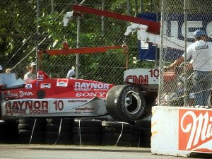
| Car flying in a most exciting way. |
Adjectives to the rescue!
A nice way to spice up a dull description is pack in adjectives at just about every appropriate opportunity. While this may seem a little fabricated, it often does wonders in improving the interest level of a place. While this may seem obvious to a lot of people, a thesaurus is also an invaluable tool when struggling with your thirty-fifth "road through forest" description. So try to make that stove squat, those cliffs loom, and the trees tower. Then, once you've used up all the stereo-typical adjectives, consult your thesaurus for more interesting ways of describing more of the same. Try to avoid rewriting the same information in a different way, however. This really only helps if you're continually mentioning the same things throughout an area, but won't do much for making each description suitably unique.
Fancy graphics
ASCII art is quite common on muds, and in small doses can look quite pretty. The real appeal it seems, is not that it looks good, but that someone actually managed to make text resemble a picture. Even a hastily drawn black and white bitmap usually looks a lot nicer than ASCII art, so if you want to use a lot of ASCII art on your mud, maybe you should investigate some of the newer graphical muds, or include support for mud clients like Pueblo, which are capable of presenting proper images.
ASCII art has a lot of problems associated with it. If the player isn't using a fixed width font, or if their column length is different, your meticulously drawn ASCII picture may be presented as a meaningless jumble of text on the screen. This could give an especially bad impression if your login screen has an ASCII picture on it, and could potentially cause people to dismiss your mud before they even create a character. At the end of the day, text-based games aren't good at showing graphics, and the appeal should really come from nicely written and presented text. I usually relegate ASCII art for use only in signs and the occasional map.
